Authors: Frank J. Poelwijk, Michael Socolich, and Rama Ranganathan
Synopsis
In this paper, the authors created all \(2^{13}\) intermediary genotypes between two variants of a fluorescent protein separated by 13 base pairs, one red and one blue. They measured the phenotype for all genotypes (combined red + blue fluorescence). They computed various forms of epistatic effects (background-averaged and single-reference) on the phenotype across all orders. They found that (1) a lot of epistasis is present across all orders, but (2) phenotypes could be accurately predicted from a very small amount of epistatic terms, demonstrating that these effects were sparse.
Summary
Figure 1
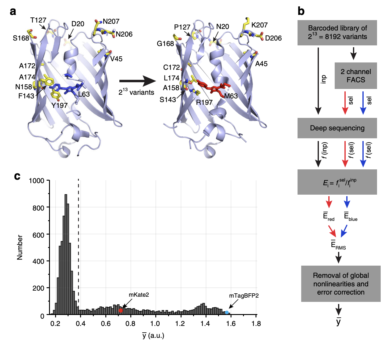
Experimental overview.
1a: There are 13 base pairs that separate two variants of the eqFP611 protein, a fluorescent protein found in the sea anemone Entacmaea quadricolor. These two variants are called mTagBFP2 which has a blue color (left) and mKate2 which has a red color (right). There are \(2^{13} = 8192\) possible genotypes connecting these two variants.
1b: The authors constructed all 8192 genotypes via combinatorial mutagenesis in population of E. coli. FACS was used to retain cells above a certain fluorescence of either the red or blue color. Each genotype was matched to a unique barcode. This barcode was sequenced in the population of sorted cells in order to identify the enrichment of each genotype for each color, computed as the ratio of reads in the sorted population vs. the input population. This ratio is a proxy for the fluorescence of the genotype. For example, if a given genotype is bright red, then its corresponding barcode will have high enrichment in the population of cells with red fluorescence above a certain threshold. The enrichment scores for both red and blue fluorescence were combined quadratically (by taking the square root of the sum of the squares) into a single fluorescence score \(\overline{y}\) as the phenotype. (Would it make sense to treat the red and blue colors as separate phenotypes?)
Next, along with various other quality control steps, the phenotype was transformed in order to remove “global nonlinearities.” The rationale is that any nonlinearity in the phenotype across genotypes is attributed to genetic interaction effects, but if this nonlinearity is present across all genotypes, then it is biologically uninformative and more likely a consequence of the experimental or measurement process. The authors accomplished this by raising the phenotype to some power \(\alpha\) that maximized the variance explained in the phenotype by only 1st and 2nd order effect sizes (see below for how to compute 1st and 2nd order effect sizes). They ended up with \(\alpha = 0.44\). In practice, the authors found that transforming the phenotype in this way did not have a large impact on downstream analyses vs. no transformation (i.e. Figure 2e and 3b look the same). This is quite surprising to me. Shouldn’t taking basically the square root of the phenotype change the “nonlinearity” in the phenotype a lot? Maybe the phenotype does not have a large enough dynamic range for the transformation to change its shape that much.
1c: The distribution of fluorescence scores for all 8192 genotypes. mKate2 and mTagBFP2 are indicated in the figure. Most genotypes exhibit low fluorescence (below the detection limit indicated by the dotted line).
Figure 2
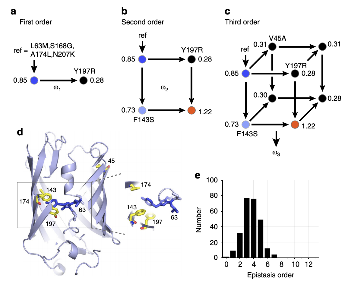
Definition of epistasis.
2a: First order effect for a given variant is computed by taking the difference in the phenotype containing the variant vs. without the variant, then averaging this difference over all 212 background genotypes for the remaining variants. This procedure is known as “background-averaging.” Shown are the fluorescence values for the presence vs. absence of the Y197R variant with a single arbitrary genotype as the background.
2b: Second order effect for a given variant pair is computed by taking the difference in the first order effect of one variant with vs. without the other variant present. Alternatively, we can take the phenotype with both variants, subtract off both 1st order effects for each of the variants (with respect to the background phenotype), and subtract off the background phenotype. These two procedures are equivalent. As before, we average this value over all 211 background genotypes for the remaining variants.
2c: Third order effect for a given variant triplet is computed by taking the difference in the second order effect of any two variants with vs. without the other variant present. Alternatively, we can take the phenotype with all three variants, subtract off 1st order effects for all variants (with respect to the background phenotype), subtract off all 2nd order effects for all pairs of variants (with respect to the background phenotype), and subtract off the background phenotype. These two procedures are equivalent. As before, we average this value over all background genotypes.
In general, given \(N\) mutations, background-averaged epistatic terms are computed using the following formula:
\[ \overline{\omega} = \Omega \overline{y} \]
where \(\overline{\omega}\) is a \(2^N\)-vector of interaction effect sizes, \(\Omega\) is the “epistasis operator” (which is actually exactly the Walsh-Hadamard transform (something like a discrete analog of the Fourier transform) up to a scaling factor), and \(\overline{y}\) is the mean phenotype for all \(2^N\) genotypes.
2d: Variants involved in large epistatic interactions. These variants are found all over the gene.
2e: Distribution of 260 significant epistatic effects (P < 0.01 after applying Bonferroni correction). As far as I can tell, the authors don’t describe how they compute standard errors for estimates, though they show that standard error increases with the order of the effect in the supplement. The authors state that the distribution of significant epistatic effects when using the single-reference rather than background-averaged definition of epistasis looks similar (though they don’t elaborate on which genotype was chosen as the reference). Is it possible to draw some conclusion on the relationship between effect size sparsity and order? Right now, the increasing standard error as a function of order acts as a confounder.
Figure 3a-b
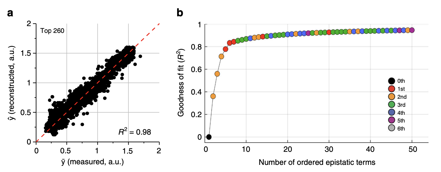
Phenotypic prediction from all (left) and top (right) epistatic terms.
3a: The phenotype can be very accurately reconstructed from the 260 significant background averaged epistatic terms
3b: The phenotype can be accurately reconstructed from very few epistatic terms. The authors obtained a prediction \(R^2\) of 0.8 with only 5 epistatic terms, comprising only 1st and 2nd order terms (wow!).
Figure 3c-e
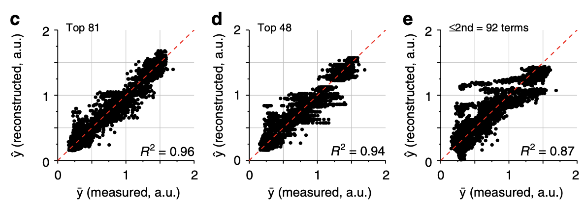
More phenotypic prediction.
3c-d: The phenotype can be accurately reconstructed from the top 81 or 48 terms.
3e: The phenotype is less accurately reconstructed from just 2nd order terms, demonstrating the importance of higher order terms.
Figure 3f
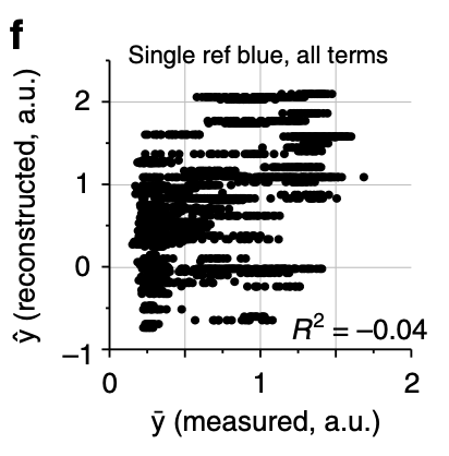
Phenotypic prediction from single-reference epistatic terms.
3f: The authors computed single-reference epistatic terms (using the original blue genotype as the reference). They found only 31 significant terms (doesn’t this contradict the authors’ previous statement that the distribution of epistatic effects looks similar using the background-averaged vs. single-reference definitions?). Moreover, the authors found that changing the reference genotype significantly changed the number of significant terms (but show no data). As shown in the plot, the phenotype cannot be reconstructed from the significant terms. I’m assuming that the authors meant to report R rather than R2, as evidenced by the negative sign. The authors conclude that single-reference epistatic terms are not sparse, unlike background-averaged terms.
I find this plot interesting and confusing. What’s confusing is that there is no predictive power whatsoever for the single-reference terms, which seems like it should contradict the fact that the terms are “significant” somehow. Why is the predictive power of single-reference epistatic terms so much worse than background-averaged terms? If the phenotype was transformed in order to maximize the variance explained by 1st and 2nd order terms, how is there no predictive power at all? Something is weird here.
Supplementary Figure 8
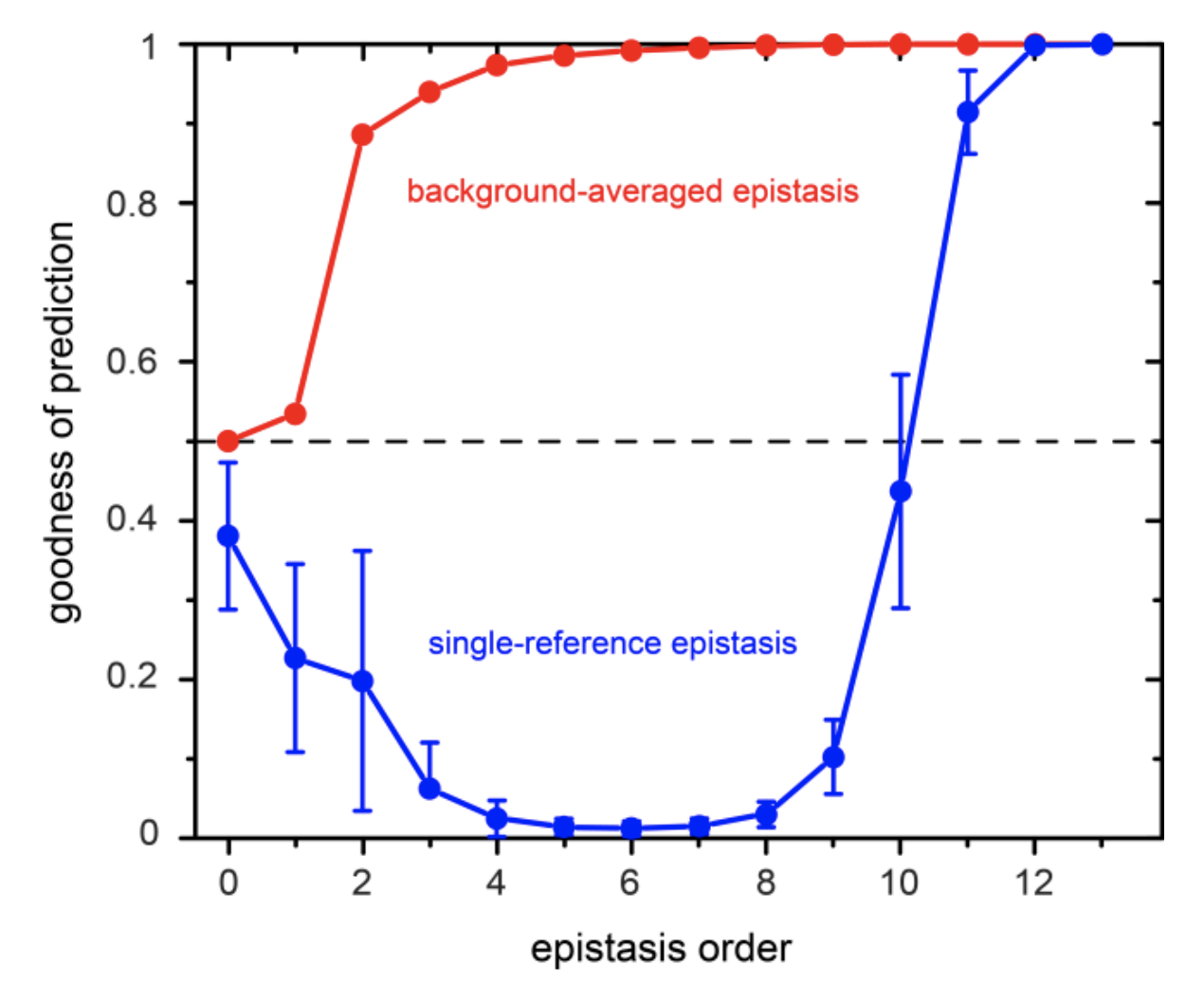
This plot shows the goodness of prediction in the phenotype (defined by the authors as \(\frac{1}{1+ SSE/SST}\) or equivalently \(\frac{1}{2 - R^2}\)) of epistatic terms of various orders.
There are some errors in this plot. First, according to the authors’ definition of goodness of prediction, it cannot be lower than 0.5. I’m assuming that the y-axis is meant to be \(R^2\) rather than goodness of prediction. Another question: is epistasis order meant to be cumulative (a.k.a. epistasis order = 2 means both 1st and 2nd order terms)? The background-averaged epistasis curve suggests that this is the case. However, how then does prediction get worse as you add more single-reference epistatic terms? Finally, if we take the plot at face value and assume that most of the predictive power of single-reference epistasis comes from very high order terms (11th and up), then doesn’t this contradict the fact that the phenotype should have been transformed to maximize the variance explained by just 1st and 2nd order terms? This plot makes me question the authors’ conclusions about single-reference epistasis.
Figure 4
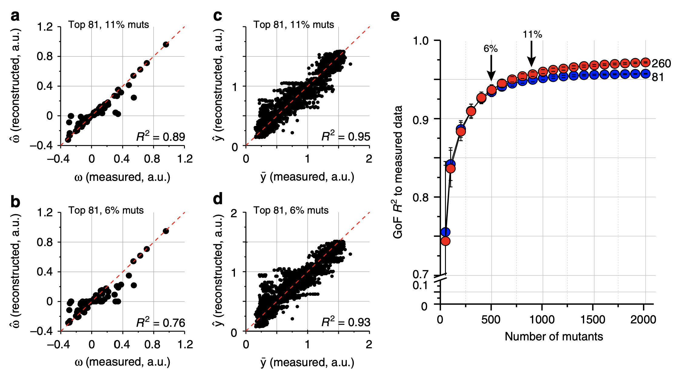
Phenotypic prediction and epistasis estimation from down-sampled genotypes.
4a-b: Top 81 epistatic terms estimated from random 11% (a) and 6% (b) of genotypes vs. all genotypes. Terms were estimated using LASSO.
4c-d: Phenotypic reconstruction from epistatic terms estimated from downsampled genotypes in 4a-b.
4e: Phenotypic prediction accuracy when varying the number of samples (x-axis). Red vs. blue points are from predicting the phenotype with 260 and 81 epistatic terms respectively.
Figure 5
Comparison with sequence correlations.
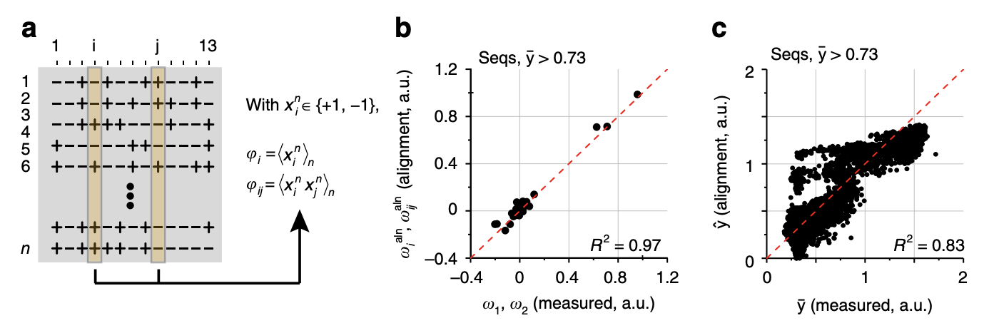
5a: An alternative way to learn the 1st and 2nd order effects is to take all genotypes with brightness above a certain threshold, encode the variants with 1 and -1, and take the average value across all genotypes (for 1st order effects) or average value of the product of the variants across all genotypes (for 2nd order effects). Does this procedure generalize to 3rd and higher order epistatic terms?
5b: Interestingly, the values obtained from this procedure are very close to the background-averaged epistatic terms (up to a scaling factor that depends on the total number of sequences and number of functional sequences).
5c: Prediction of the phenotype from the correlation-based effect sizes estimates.
Figure 6
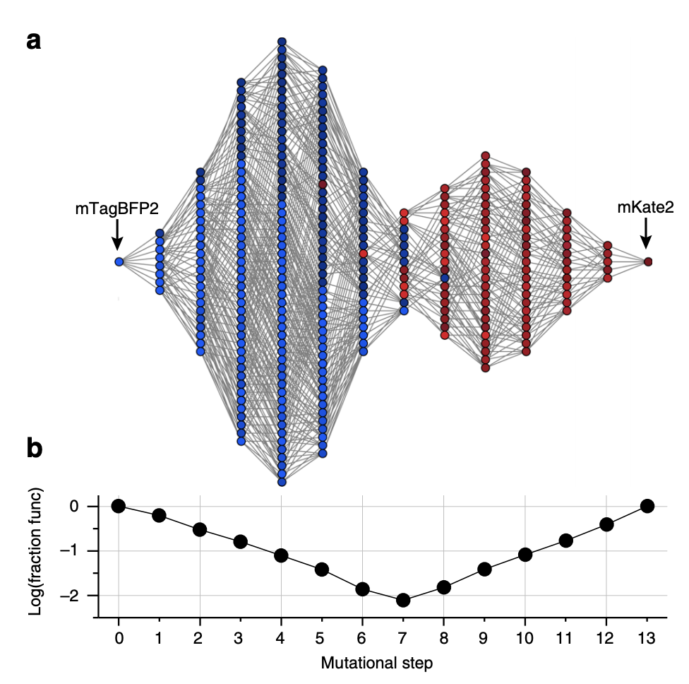
6a: All genotypes with bright greater than or equal to mKate2 are shown here, with lines connecting all genotypes separated by 1 variant.
6b: The fraction of functional genotypes vs. the total number of possible genotypes. The middle step has the most possible genotypes yet the smallest fraction of functional genotypes. The authors state that this is a sign of “severe epistatic constraints on mutational paths.” This middle step is also where the color switches between red and blue.